Wanderful Loves
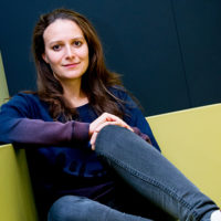
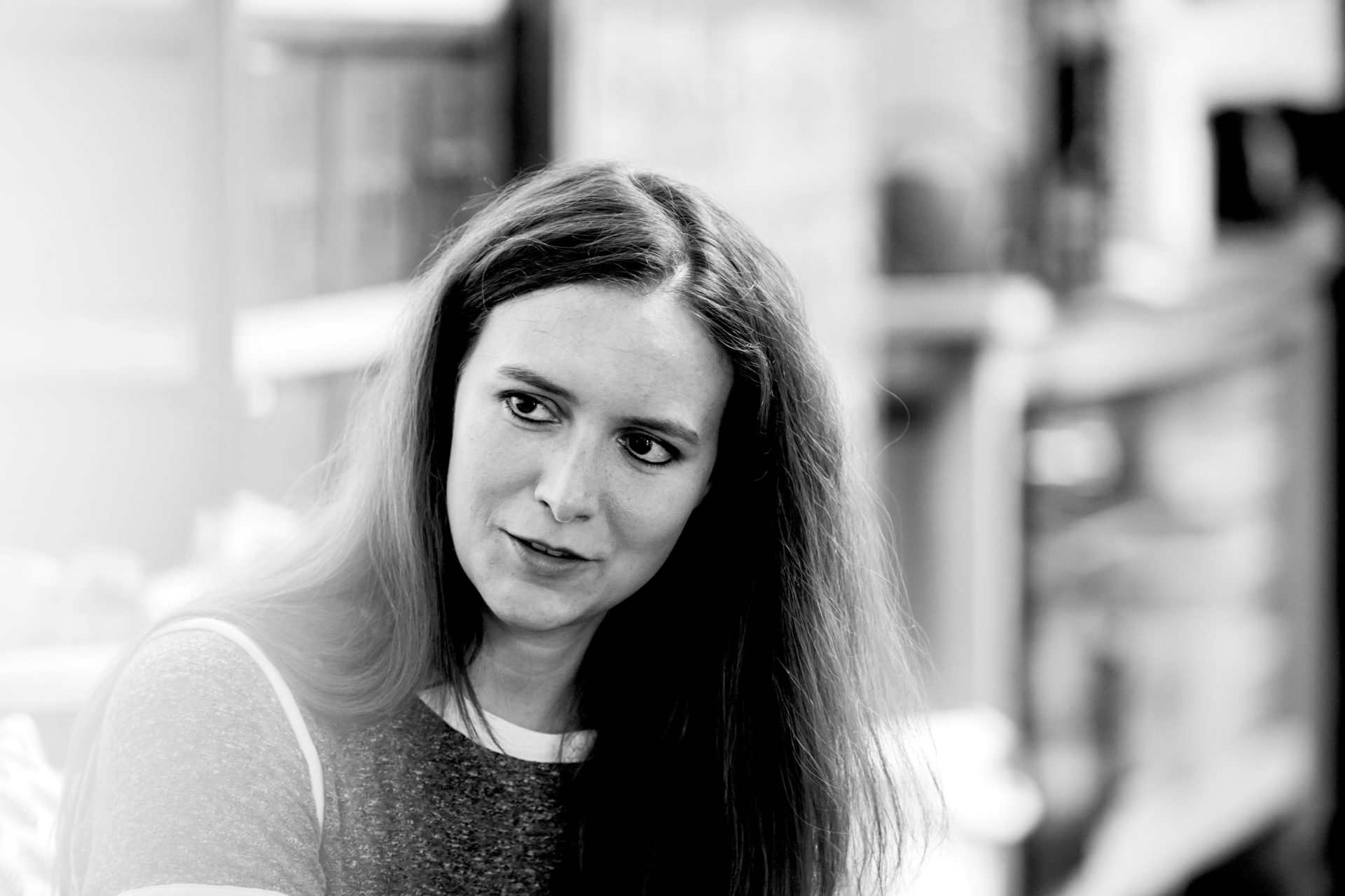
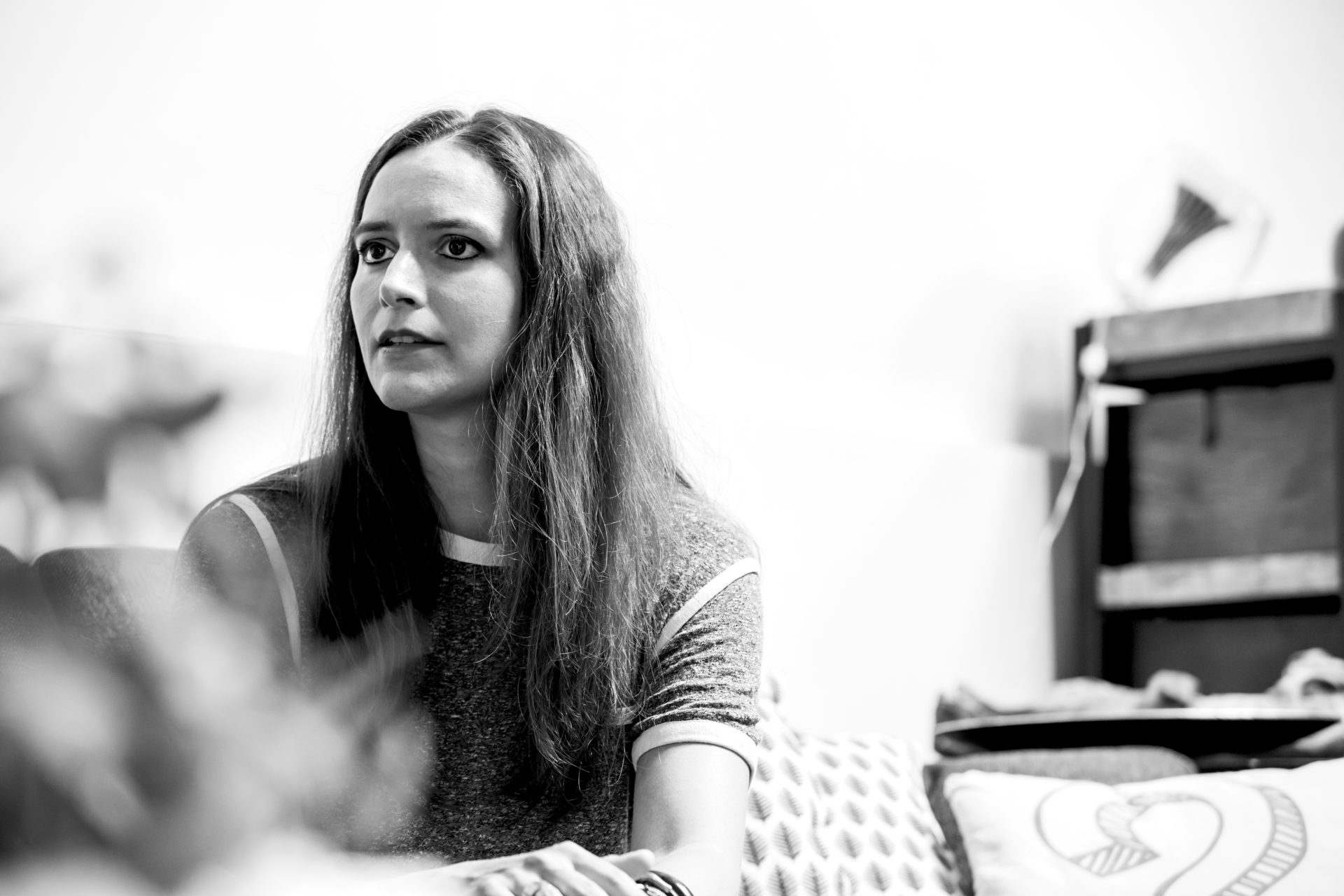
Ann Bessemans is a graphic designer and typographer. For her doctorate, she developed the Matilda font, adapted to the needs of visually-impaired children. Matilda is a font which helps visually-impaired children who are just starting to read.
Whereas most modern serif fonts have dashes at regular intervals from each other, it’s easier for visually-impaired children to learn to read if the rhythm of the letters is disrupted. Ann Bessemans draws on pre-modern fonts, and bases her theory on scientific research. The font will be completed soon, since there are already two publishers who have expressed an interest in publishing.
Visual impairment
“Visual impairment is a special problem. When someone becomes visually impaired due to old age, they already know how to read. So letter designs for that target group focus mainly on comfort of reading. A child that is born with a visual impairment, who still has to learn how to read, has completely different needs. I developed Matilda during, and after, scientific and subjective legibility research. Obviously, Matilda is not the ultimate solution for the reading problem, but it offers help, as do glasses, a magnifying glass or better lighting.”
Science
“I describe myself as a designing researcher, in the sense that I combine the artistic reflective with the scientific analytical. I try to let myself be inspired by the science, and get inspiration for my designs from that. There aren’t many of us yet. I see it as a development which will make the design world a little bigger. I hope that in the future, more people will work like this, not as a kind of competition but rather as a sounding board.”
Wanderful Loves
Related Articles

Magazine › Interview
Portrait Frederik Delbart – Recor Home
As creative director of Recor Group, Frederik streamlines the five…
Magazine › Interview
MUSIC_AIDED_DESIGN.mode
Nick Peeters and Simon Van Pottelbergh (1994) studied at the…